
Eco Foodprint App
July 22, 2018WildFork Usability Testing Report
Introduction & Research Objectives
https://wildforkfoodsdev.myshopify.com/
The usability testing focuses on the evaluation of key elements of Wild Fork’s online experience including website and mobile experience. The research of findings would help WildFork Foods to achieve its business goals of increasing sales and brand building by providing effective strategies and solutions. The test session was conducted in English.
The research objectives are as follow:
1. Discover any issues with the user experience
2. Gather feedback on Brand impression and understanding of creative concepts, provide valid improvement strategies.
3. Assess whether the information architecture good for the user to find what they want, and how to improve it.
4. Test the usability of "Delivery" and "In-store pick-up" service options, including the function, Design and contents. Gather feedback to improve these service.
5. Find out what issues prevent user being engaged and making the purchase decision, provides the valid solutions to issues.
6. Gather feedback about the whole purchase path to make it more clear, easy to use, and reduce the abundance rate.
7. Gather feedback on various contents, especially product information and creative concepts.
8. Gather feedback on mobile experience, increase the consistency between mobile and desktop
9. Provide a clear decision on the following areas of visual design:
- what should be displayed in the fold of Home page
- The positions of call-to-action elements
- The visual hierarchy
- Responsive design pattern
- web/mobile style matches the brand logo
Methodology & Facility
Usability Testing of Wild Fork Foods was facilitated on April 16, 2018 in one-on-one moderated sessions at the George Brown St. James Campus. The 45-minute testing sessions with 3 participants included 7 tasks, including 6 tasks of website and 1 task of mobile. All the data and feedback were from 3 participants during the test sessions. The test areas mainly focus on brand concepts, home delivery, In-store pick-up, purchase path and mobile-desktop consistency. The issues would be measured by a severity rating system includes critical, major, medium, minor and bug, which were related to priorities of problem-solving. According to the findings, we provided valid solutions and suggestions for improvement. The test session was conducted at School of Design in George Brown College. The website evaluation was conducted on a computer running Mac OS, and viewed at a 2560x1440 pixel screen resolution using the Chrome browser. The mobile prototype evaluation was conducted on an iPhone using a safari browser. Each participant took the task independently in a room, the test session was recorded by video.
Participant Summary
We recruit 3 participants who were screened for criteria provided below for our usability test session. During the session, participants were asked to perform a few tasks on the website and mobile and the moderator asked participants related questions and feedback. All participants got CAD$100 as an incentive after completing the session.

Participant Feedback Highlights
- "I wish it was more obvious where I landed"
- "I need to stress the benefits of WildFork instead of traditional stores"
- "I have no ideas actually"- referring to "Frozen is Fresher"
- "I am not sure how much I need to buy for 10 people"
- "The phone is better, easy to notice scrolling capabilities"
- "It looks fresh, unique" - referring to the first impression if Homepage
- " I like the visual aspects, I would like to see more"
- " I guess blast freezing is supposed to be better"
- "It’s not enough time slot options for In-store pick-up, I might abandon the order"
- "I feel confused about the product information"
Overview of Findings
According to the response and feedback from three participants, we found that users were able to complete most of the tasks, it was easy to explore information and concepts. However, when given some specific purchase tasks, they showed confusion and even not sure they completed or not. It’s easy to find out the brand concept, but it’s not impressive enough as users expected more visual content to explain. It’s easy to find out what products the website was selling, but the user didn’t notice other categories. In addition, the critical and most major issues happened at the purchase/ checkout path, which was an important part of an online shopping website. The core issue stopped user purchasing was the chaos of product info(i.e. weight, price, unit, etc) and limited options for delivery.
On the other hand, participants gave some positive feedback about the imagery, impression and mobile experience. There are two possible reasons why user liked the mobile experience, one is that users had more online shopping experience with the mobile device. Another is that the mobile design is consistent with the desktop which made it easier to use.
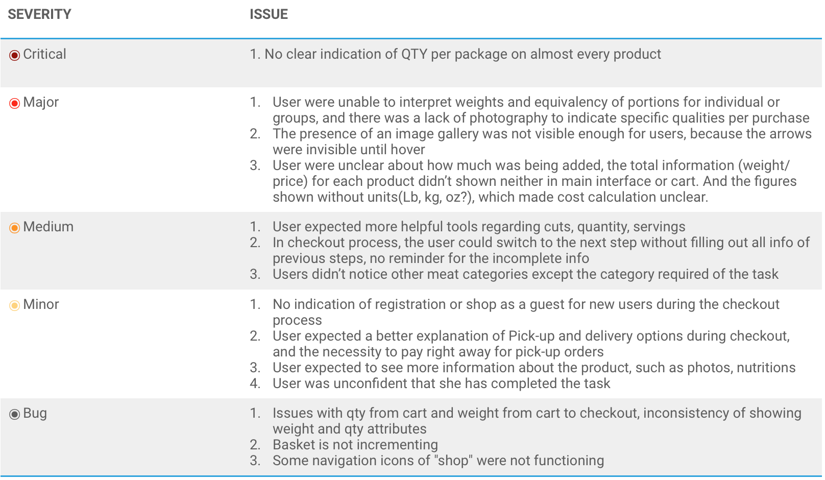
Issues Summary
27 issues in total- [1] critical, [5] major, [12] medium, [9] minor
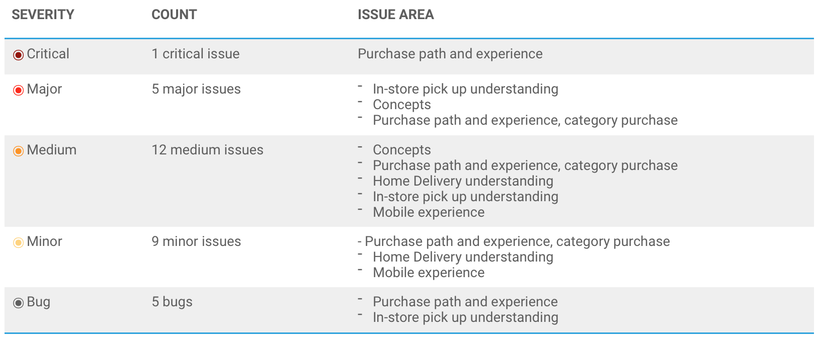
Rating system:
- Critical Show stopper. This will lead to major confusion or impediment for users
- Major A significant issue that will cause the user some difficulty
- Medium May cause confusion and inconvenience for users
- Minor Lower impact issues that may not stop user
- Bug Technical issues can be fixed easily
Issues detail and Solution
Issue Details Task 1
Task1 Scenario
You want to feed your family right; and are always looking for higher quality products, especially meat and produce. You’ve heard that a new store called Wild Fork Foods prides themselves on high-quality meat at low prices. You’d like to learn more about what sets them apart, so you visit the Wild Fork website.
Test Area
Exploration, Concepts ( Start from home page)
Task Rate (1 easy 5 hard)
All of the users thought the task easy, one user rated (1) and two users rated (2).
Potential Solutions/ suggestions
- Create more Infographics to visualize the full concepts and experience
- Make logo more visible in HOME page, make it as a part of the first impression
- Add more information about the company and its brand, including company founded time, mission, insights, etc.
- Add more content about WF main concept, "frozen is fresher", which including more visual image and concise sub-concepts.
- Make content info more readable and understandable
Issue Details Task 2
Task 2 Scenario
You recently heard about a new meat shop called Wild Fork Foods from a friend. You’re curious to know if they deliver to your home since it’s a little hectic sometimes to do your shopping with the family. Visit the Wild Fork website to find out.
Test Area
Home Delivery understanding
Task Rate (1 easy 5 hard)
Most of the users found the task was difficult, one user rated (5) and two users rated (4).
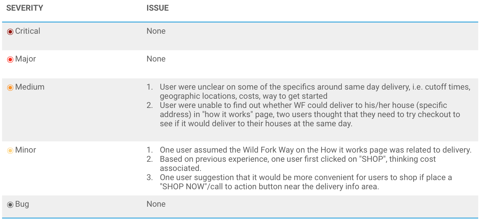
Potential Solutions/ suggestions
- Add more specific information about same-day delivery, including delivery range, time, cost, etc
- Provide search results for users to find out if their addresses within the same-day delivery range/ next-day delivery/ no delivery without proceeding checkout.
- Relocate "Wild Fork Way" content to make the content more consistent
- Place a "call to action" button in the delivery area
Issue Details Task 3
Task 3 Scenario
You’re at Loblaws, trying to find everything on your list, but are very unimpressed by their meat selection. You decide that you’re going to buy your meat from Wild Fork instead, but want to see if it’s possible to order now and pick it up on your way home
Test Area
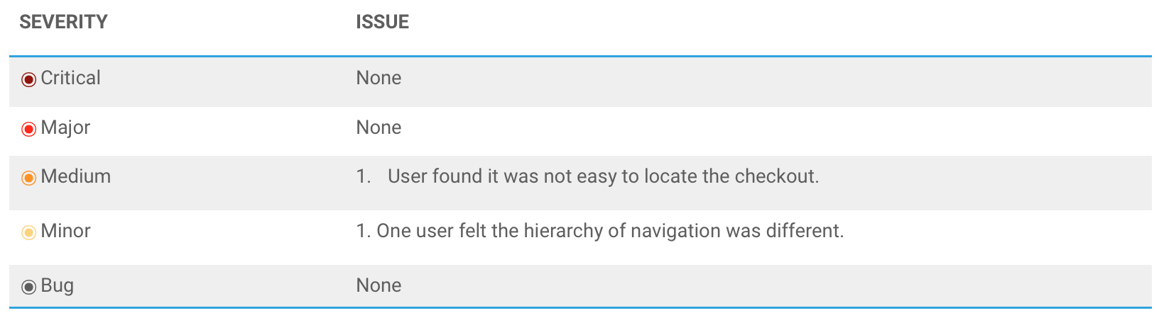
In-store pickup understanding
Task Rate (1 easy 5 hard)
Most of the users found the task was very easy, all users rate (1) for this task
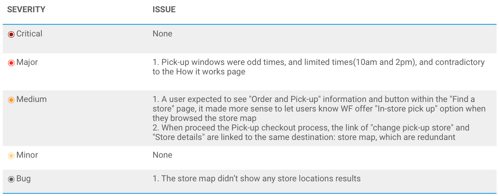
Potential Solutions/ Suggestions
- Offer more flexible time pick-up options, such as more available time duration and the soonest time that they can pick up."It will be ready any time after [Time]."
- Add link or info about the in-store Pick-up within the "Find a store" page to increase the coherence.
- Add call-to-action button "Order and Pick-up" within the "Find a store" page, which would increase the conversion rate and purchase engagement.
- Combine "change pick-up store" and "Store details" as one link.
- Fix the map bugs
Issue Details Task 4 & 5
Task 4 Scenario
You have a big family dinner this Sunday and are tired of the usual lasagna. You decide that THIS Sunday dinner is going to be steak night! Go to the Wild Fork website and buy enough steaks for your extended family of 10.
Task 5 Scenario
You’re in charge of picking up something for dinner tonight and are in the mood for pork. On the Wild Fork website, buy enough for the whole family.
Test Area
Purchase path and experience, category purchase
Task Rate (1 easy 5 hard)
Task 4:
The rates of task 4 varied from user to user. One user rated (1) easy, one rated (3) and one rated (5) difficult. For the user who rated this task easy, he still wasn’t clear how much quantity of steak he would need for his family of 10.
Task 5:
The rates of task 5 varied from user to user. One user rated (1) easy, one rated (3) and one rated (5) difficult. User liked the cart saver when he ended the checkout and continued shopping, which made the task become easier.
Potential Solutions/ suggestions
- Indicate the product’s size and price in a consistent way, such as [$]/EA, [$]/lb
- Add a purchase guideline to indicate weight ranges of different products for per person for consumption. And add a product photo in the package to indicate portion size
- Show instant updated info while changing the qty of each product, including total weight and price
- Make the additional photos more visible by presenting visible left/right arrows which are common icons to show photo gallery.
- Add filters to help choose product, create a guide for choosing cuts and grades, intersperse collections page with infographic on animal/ cuts, and potential availability of filters as a result
- Set up a checkout process which needs user to fill out all info to move to next step, prevents skipping required information
- Shows a clear purchase path to indicate the completion of every single step and the completion of the order
- In the second step "Info", shows register or shop as a guest option below the contact information text filed for new users. Also, the status on the header changes to username to indicate logging in a user account if user chooses the registration option.
- Better concise content or link in checkout regarding delivery and pick-up options
- Provide order tracking search or info for users
- Recommend related or popular products for user during the purchase process, lead user to explore more categories on the website
- The icon for hiding basket info should be a right side arrow
- Align the UI elements( image, button, header, etc) to make the layout more organized.
- Add review/ live chat function, make the shopping experience more completed
- Fix functional bugs
Issue Details Task 6
Task 6 Scenario
While browsing the Wild Fork website, you can’t help but notice the “Frozen is Fresher” statement displayed in a few places. You’re curious about this concept and want to understand what it means.
Test Area
Concept exploration, brand building
Task Rate (1 easy 5 hard)
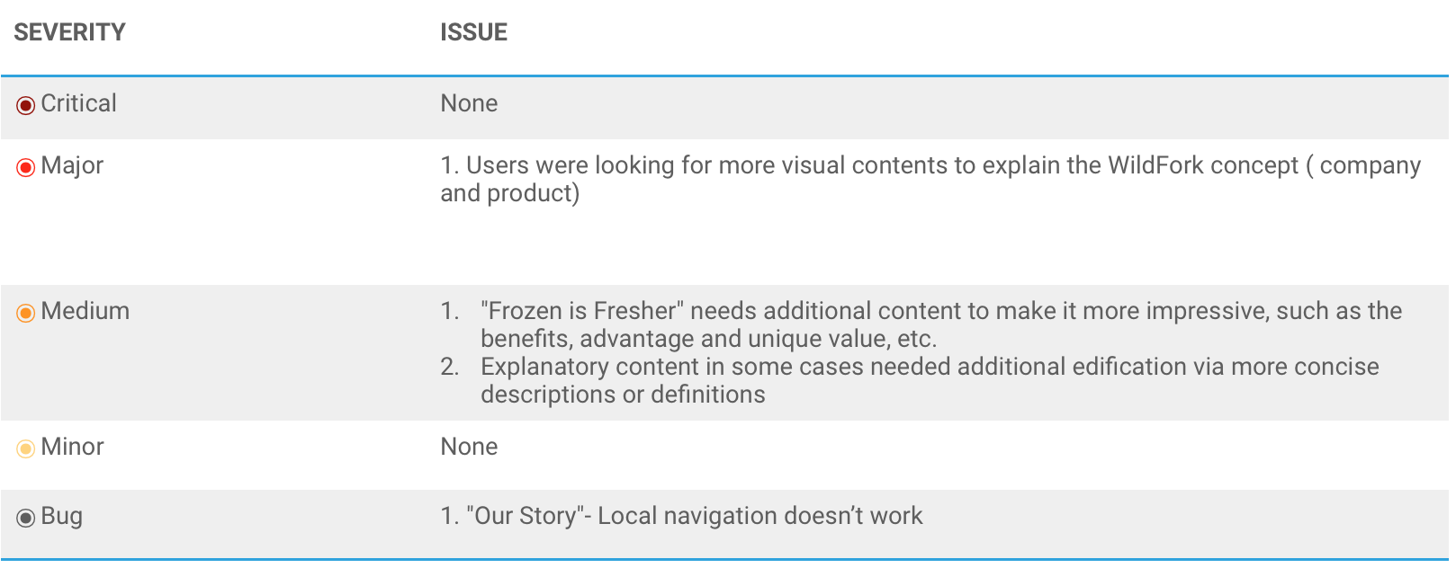
All users found this task easy, rated between 1 and 2, however, they thought WF could improve its concept to be more impressive
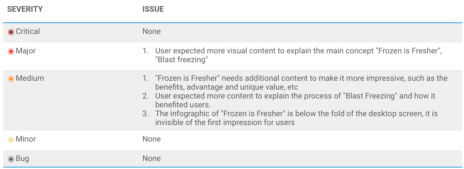
Potential Solutions/ Suggestions
- Surface the main concept somewhere within the fold or in the hero area
- Present the concept of "Frozen is Fresher", "Blast Freezing" with various visual content such as graphic, video, and animation.
- Develop the content of concepts by describing its benefits, advantages and unique value.
- Combine the concept with WF company culture, mission and visions, build the brand when explaining its creative concepts.
Issue Details Mobile Task
Task Mobile Scenario
Respondents browsed the Wild Fork website with mobile and get their general impressions.
Test Area
Mobile experience, consistency between mobile and desktop
Mobile experience overview
All users found mobile interface was consistent with the desktop, and it’s easy to use. Some user preferred the mobile version more the desktop because it was easy to notice scrolling capabilities, and thought mobile is more convenient for online shopping. Users noticed frozen meats were products WildFork sold, but only knew about limited ranges of products.
- Potential Solutions/Suggestions
- Make sure the UI elements and hierarchy are consistent with desktop
- Place some important functions in obvious positions, or highlight call-to-action buttons
- Indicate a clear purchase path and a visible status
Conclusion
To recap, the usability testing of WildFork Foods online shopping experience went well, these finding and solutions will be helpful to achieve the research objectives and ongoing improvement. As the users expected more visual content of the brand and clear purchase info, some consideration should be given to these areas for the next steps.
Brand visualization
Increase the brand awareness of WildFork Foods by visualizing the creative concepts and unique benefits. Develop a variety of visual contents to make the concepts standout of the website. Conduct test which focuses on brand understanding, find out more useful ideas for brand building
Build Clear product content and checkout process
As some users faced difficulty to understand the product and go checkout process, it is necessary to reorganize the product content, including figure, description, imagery, and cost. Make sure all contents are understandable and readable, remove the information and options which make user confused.
Provide flexible service option
Good service would be a key to make user make a final purchase action, so it’s important to provide a flexible service option to satisfy different user needs. For example, offering flexible time options for delivery and nearest store suggestion for pick-up.
Usability test for completed version website/ mobile
As some function of the website were not active, some issues were not detected. A usability test for a completed version should be conducted in an early future, the earlier, the better.