
Neoflow Oil Supply Chain Traceability
May 10, 2020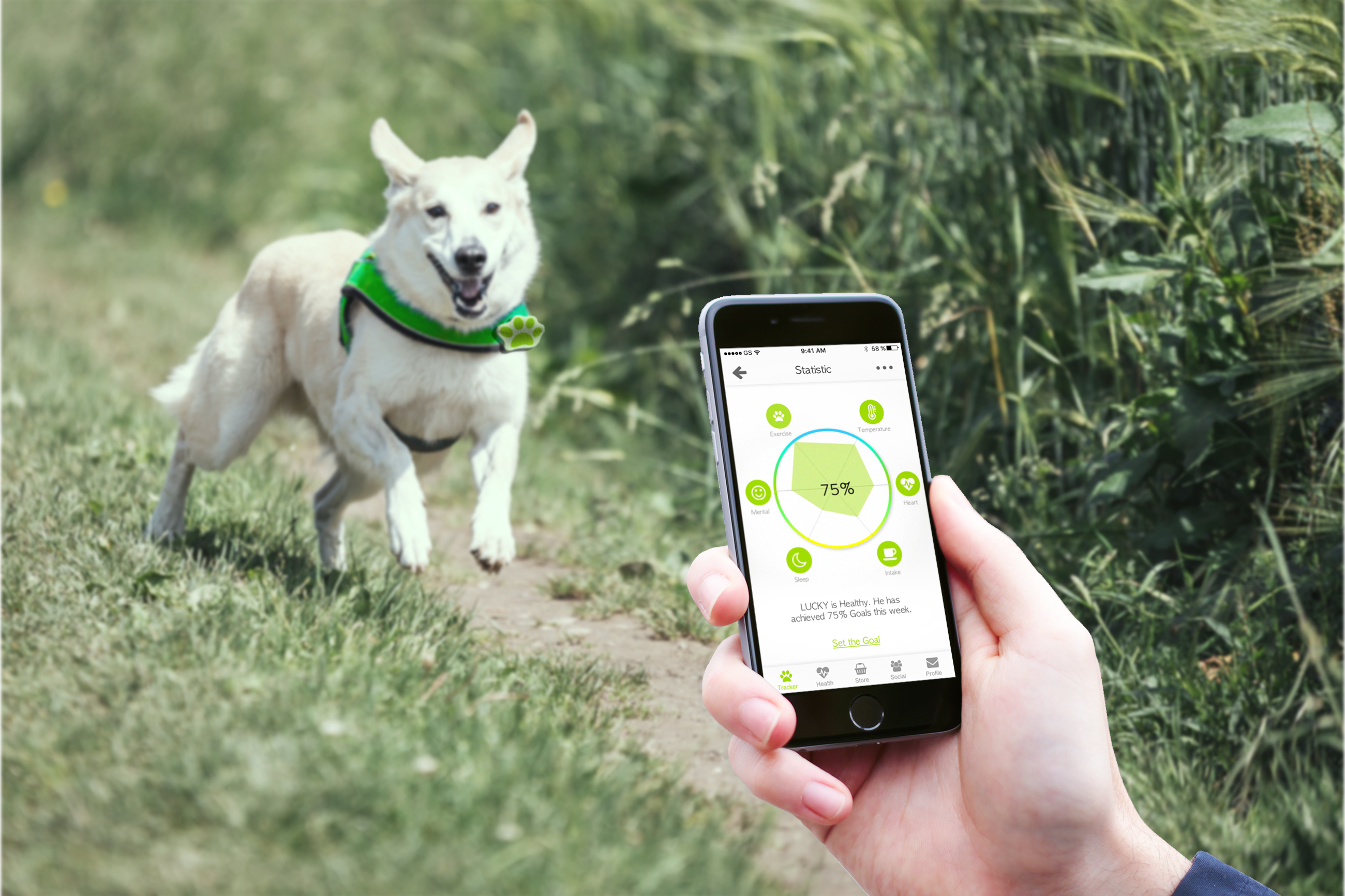
K9Paws Mobile App
July 22, 2018
Research | UX Design | Testing | 2019
Overview
QCAD PoC (Proof of Concept) project was the first phase of creating a stablecoin – QCAD which was designed to offer 1-to-1 CAD equivalency. Our project objective was to build a platform that helped prove the concept within an intensive timeline, in order to raise more funding and accelerate the speed to market.
Creative Brief
Problems
Financial transactions were time-consuming and costly. There was no convenient on-off ramp between crypto-currency and fiat currency. QCAD was a reliable piece of financial market infrastructure that improved the efficiency of Canada’s capital market.
Business Goal
Business Goal
By implementing an absolutely solvent CAD-backed stablecoin, QCAD aimed to provide liquidity and volatility sheltering to the market, accelerate wide-scale adoption and build the framework for a digitized Canadian dollar. In the PoC phase, the team also aimed to raise more funding from investors and accelerate the speed to the market.
Audience
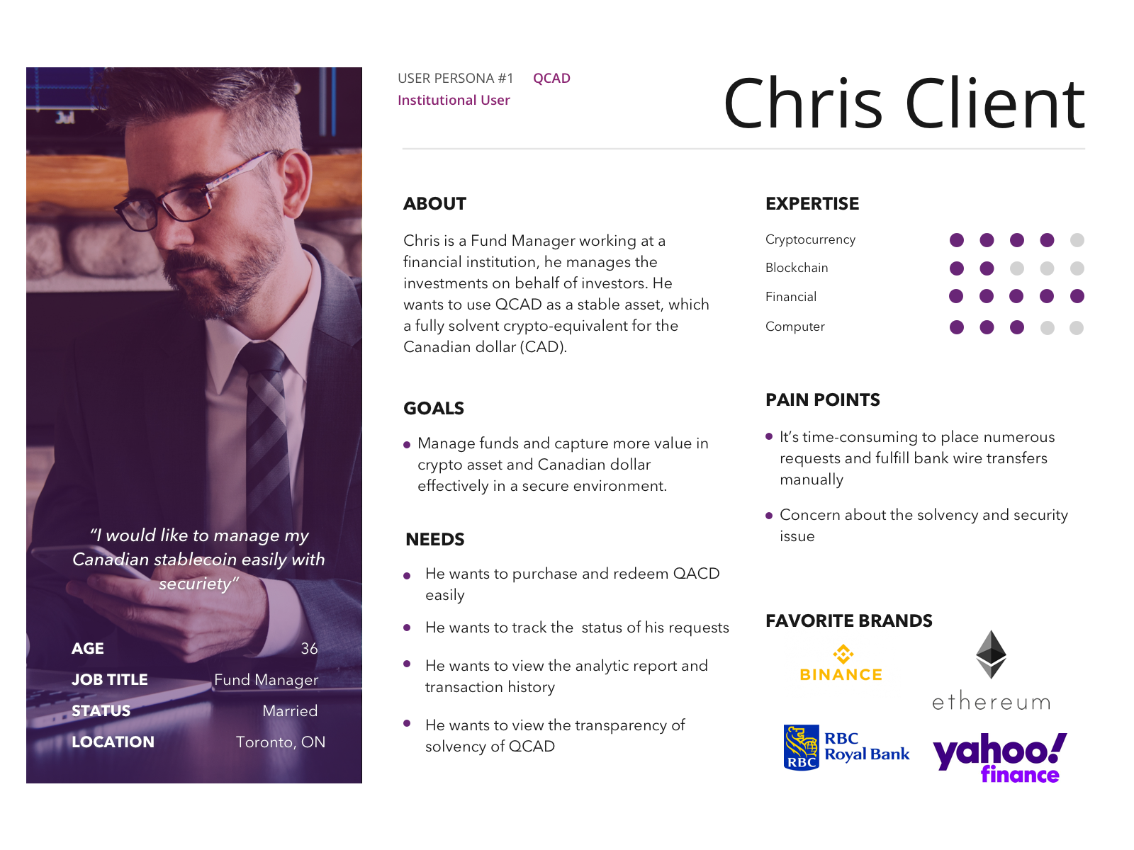
Client - Institution Users
- Who wants to purchase and redeem QCAD
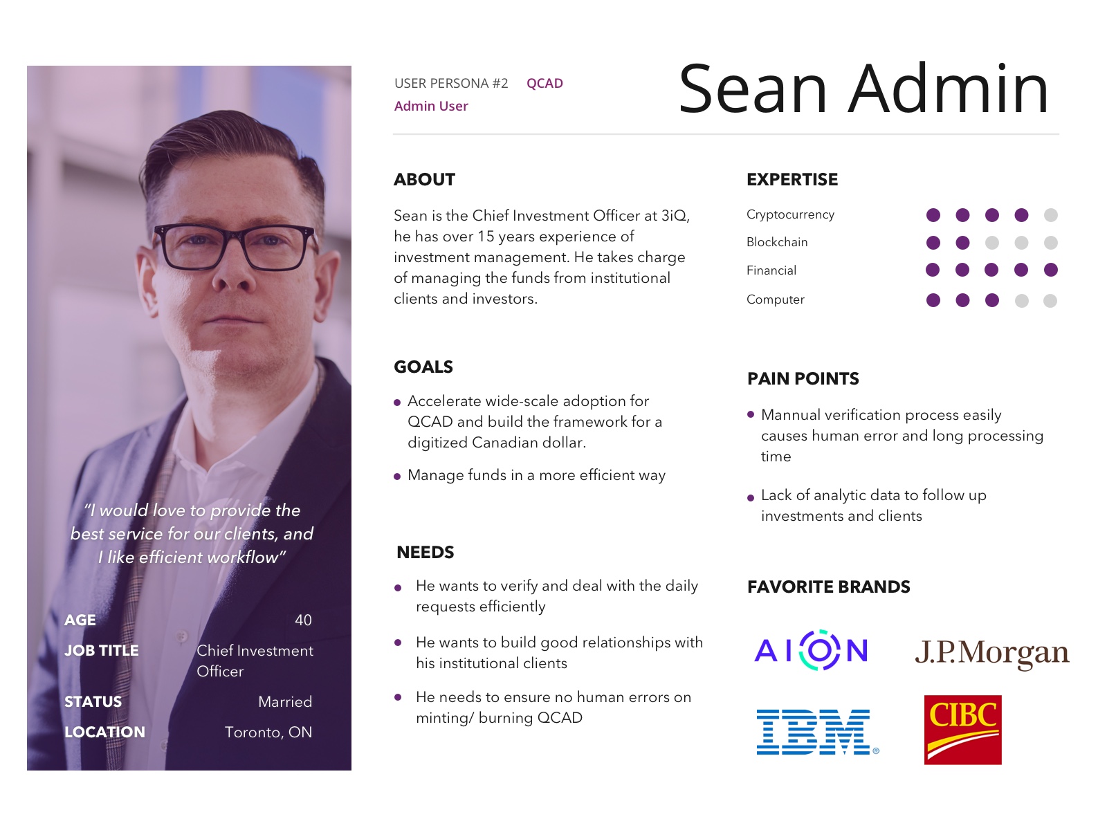
Admin User
- Who manages the QCAD requests and funds
User Personas
There were two main personas in the system, one was the institutional user – a client who wanted to purchase or redeem QCAD, the other one was the Admin who managed the QCAD requests.
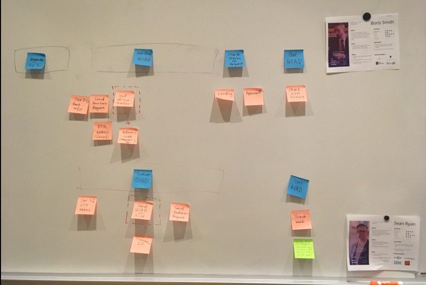
Story Map
We used a story map to map the user journey for each persona, including the steps on/ off the system and the features for future scope, which helped us understand what the user actually needs during this process.

Concept and Ideation
We faced a lot of challenges in this project, we approached it by understanding the challenges and seeking the best solution in the ideation sessions. The main challenges and questions we faced:
- How can we create a platform with minimum features and simplicity to simulate the typical scenario?
- The scenario contained both online and offline operations, how can we connect them smoothly and avoid human error?
- With the intensive timeline, how can we manage the design progress when business requirements were not fully settled?
We had brainstorming ideation to explore the concepts and strategy, we had a digital asset concept that was consisted of 5 key features to support the system

Design Concept framework
Mapping Ideation

Whiteboard Ideation
Strategy and Solutions
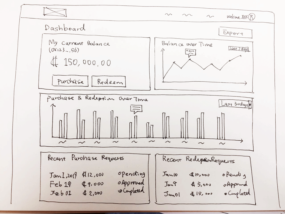
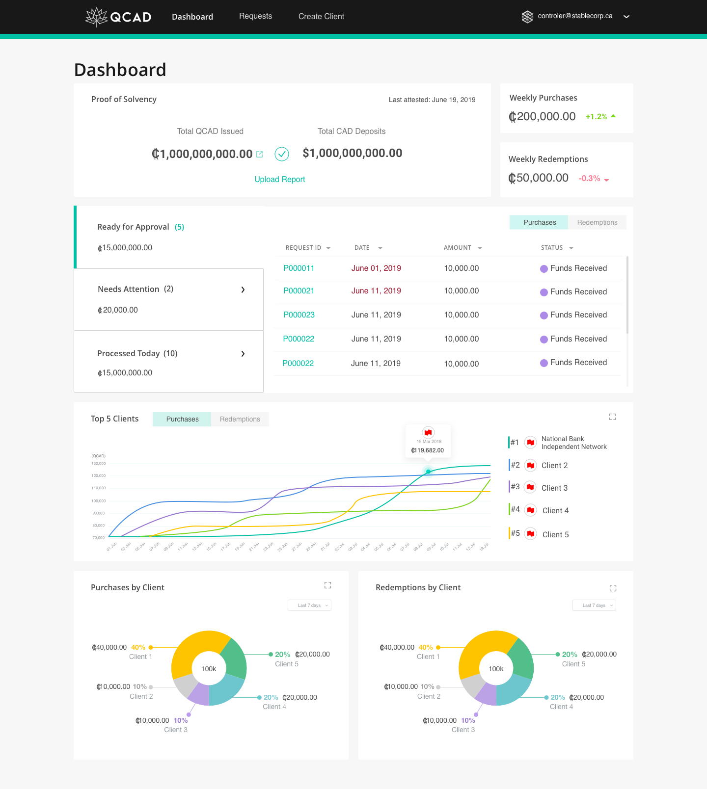
Dashboard: Information Visualization
- Dashboard for clients: A holistic overview of their QCAD assets in real-time, including QCAD amount, history analytic chart and recent transactions
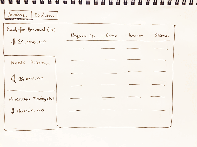
- Dashboard for Admins: increased the efficiency of request management, prioritized tasks and maintained better client relationships.
Action than read, recall than remember
- Action than read: By pushing the user to make an action (eg. radio button and checkbox), enabled the user to be aware of the important action/ info, which reduced their mental effort
- Recall than remember: Helped users recall the information instead of remembering.
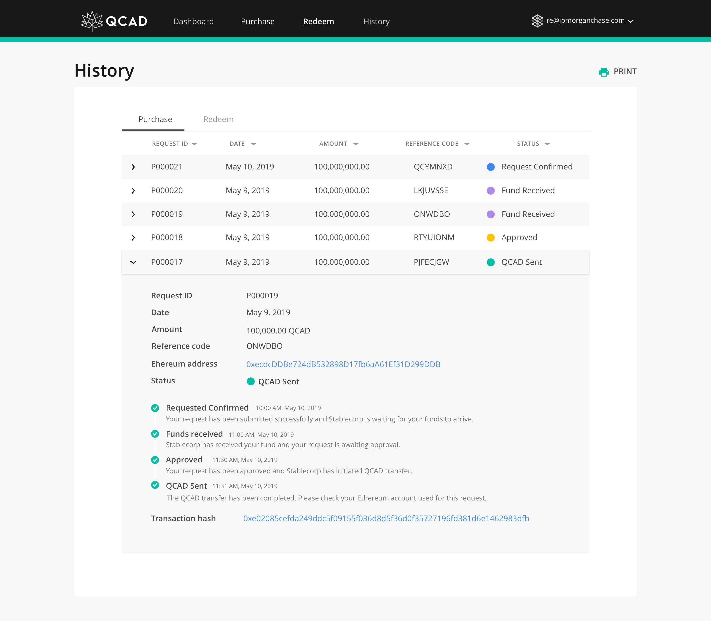
End-to-end progress flow
- Used the progress bar to indicate end-to-end flow with concise info for each step, which enabled the user to have a clear expectation for the next steps
- Keep the consistent status indicator on the history, which allowed users to track the requests easily
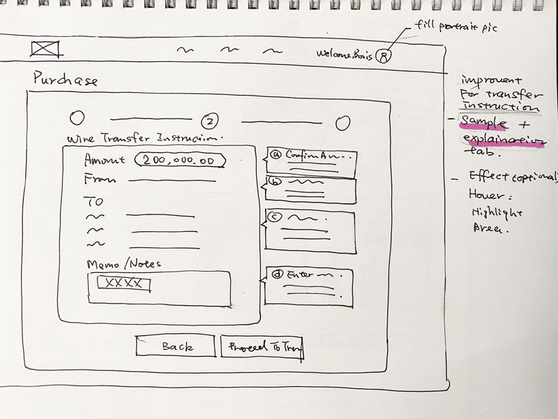
Tooltip info guide
- Provide explanation tooltip of transfer instruction to help first time user understand and also allow the experienced users to skip it.
Wireframes
Lo-fi wireframing is the most effective way to organize various ideas and gain feedback in the early on stage.
Based on the concept and the high-level design direction, we structured the layout and user flow by using the core elements, which kept the whole design lean and solve the main problems. We got the whole team and stakeholders involved in this process, which helped us gain feedback from different perspectives and ensured everyone was on the same page.
")
Wireflow
Visual Design
Colour and brand
We used black and teal as primary colours, which matched the brand identity with stable and positive feelings. We used more secondary colours on the dashboard and indicator to grab the user’s attention.
Material design and react components
In order to speed up the development progress, I worked closely with the dev team to choose the material design library and react components with customization to match the design.
Design patterns
Besides the strategies mentioned, we also implemented design patterns that met the industry standard to improve usability. For example, maintain a consistent style and flow on both the client and admin sides; double confirmation of decision making to avoid human errors; expandable tables allow users to switch between list and details.

Client Dashboard


Testing
Testing and prioritizing feedback in an agile environment
We conduct user testing with institutional users and admin users quickly, and labeled feedback as critical, major, minor, and bugs. We prioritized feedback, generated solutions and pushed for development in an agile environment, which increased the efficiency of the iteration process.

Outcomes and Reflection
Outcomes
- Got positive feedback from clients/ partners and generated leads
- Accelerated the product launch - became the first Canadian Stablecoin
- $150k CAD in reserves since launched two months
- Brought in 12 major ecosystem partners when it launched and increased 66% of partners in two months after launched
Reflection
Agile UX was good for PoC
- For a PoC project with an intensive timeline, it was challenging to complete the design from a new concept to UI level deliverables in a short period of time. The agile method ensured we iterated the solution with feedback quickly.
Apply design patterns with context
- There were so many design patterns and theory could be used for similar problems. In this case, we should choose the design pattern that was aligned with specific context and scenarios.
Be open to creative ideas from other team members
- As a designer, usually we were considered as a source of creativity. In the meanwhile, we should be open-minded, open to creative ideas from developers, business team and executive.