K9Paws Mobile App
July 22, 2018
Eco Foodprint App
July 22, 2018Toys Website Redesign
UX Research & Design

Overview
Treasure Island Toys has been an independently owned and operated toy store on the Danforth since 1988. Attributes Treasure Island Toys value most of their products are safety, quality, eco-friendly, local, play value and fun. The website redesign project will help Treasure Island Toys to build an e-commerce platform to boost the digitalization of selling and brand building. Also, it will provide a delightful user experience by combining the fun experience of toys with digital experience.
Creative Brief
Audience
- Current store customers
- Middle class customer
- Educational organizations
- Young parents
- Environmentalist
- Teens
Goals
• Boost the digitization of selling
By redesigning the website with effective strategies, the company will boost the digitization of selling by 40% and increase profits by 30% in five years, which could involve lowering expense and increasing all the sales.
• Brand building
Brand building is an integral aspect of business development. By redesigning website with upgrade features, the company will increase the consumer awareness of the brand and enhance the voice of the brand.
Visions
- Local Canadian toys brand with a long history which is trusted by local customers
- It provides high-quality toys and play-value products which is a promising tendency of toys selling
- New feature which makes memorable digital experience
- Educational and play-value toys which are target products of educational organizations
- Eco-friendly toys which are preferred by environmentalist and supported by the local government
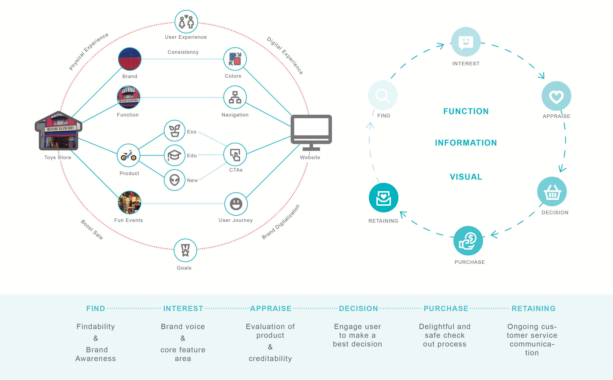
User Research
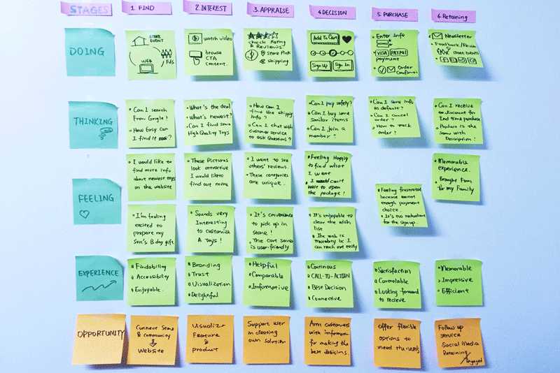
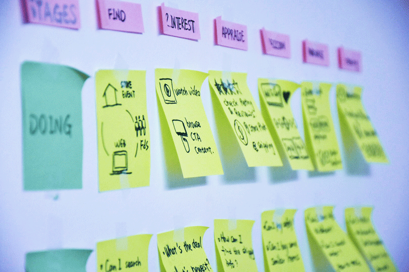
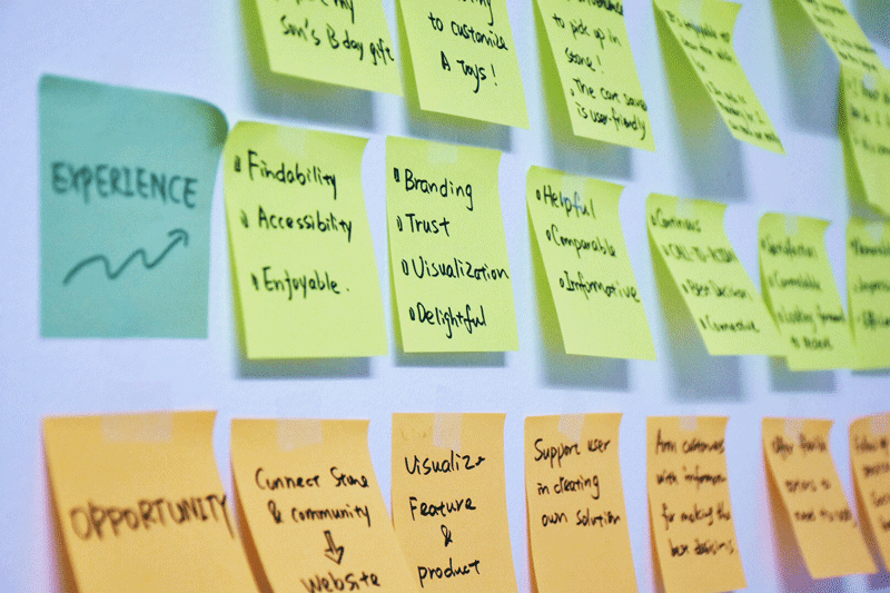
User Journey Map - Online shopping
- Define steps: User takes shopping journey with following stages: 1. Find - 2.Interest - 3.Appraise - 4.Decision - 5.Purchase - 6.Retaining
- Describe Experience: Understand what user needs from User’s perspective by describing what they are DOING, THINKING and FEELING.
- Identify the Touchpoints: Summarize the interaction points and apply to the design
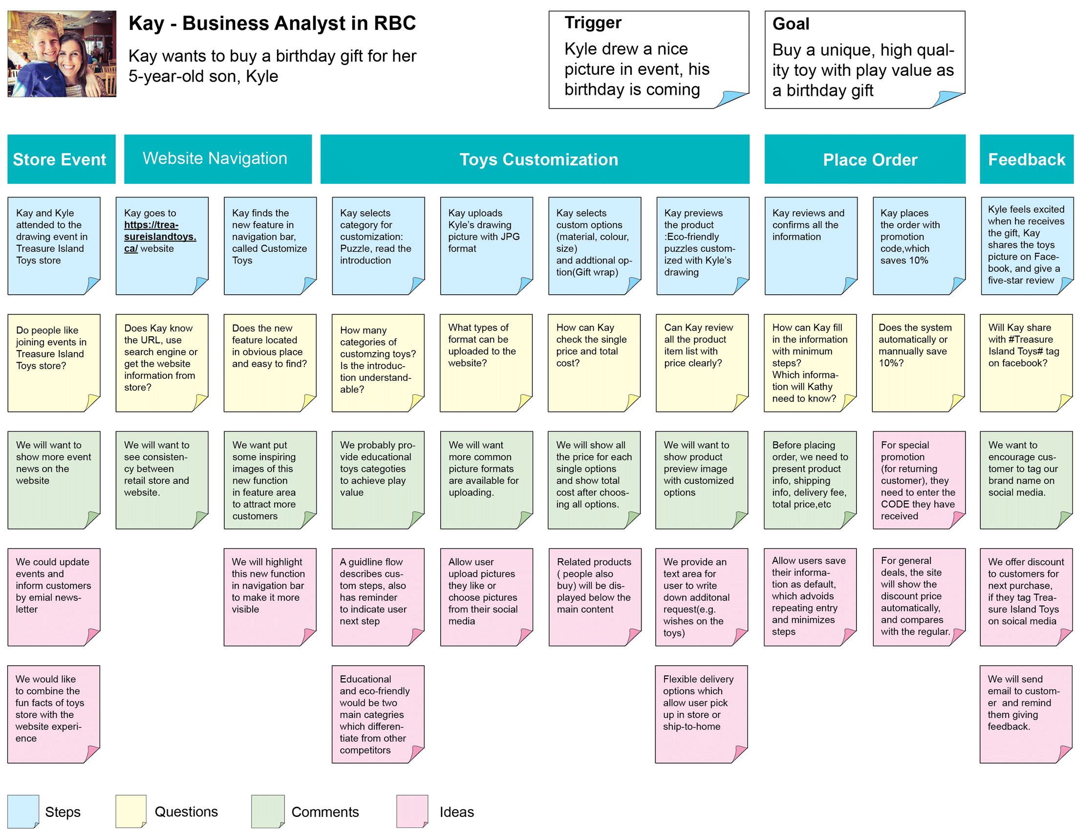
Scenario Mapping- Customize Toys
- Context and Trigger: Create a persona and scenario for website new feature: customize toys
- What we captured: STEPS, QUESTIONS, COMMENTS and IDEAS.
Competitive Analysis
Secondary Competitor:
Challenge and Opportunities
Challenge: According to the strengths and weakness of its competitors, the Treasure Island Toys redesign project faces challenges of brand building, broadening the scope of website presence, and creating an all-around user experience.
Opportunities: combining widespread-retail fun facts with digital experience, creating beautiful and call-to-action layout would be helpful to attract more young parents and teen users who have increasing demand of high-quality toys and interesting user experience.
Wireframe

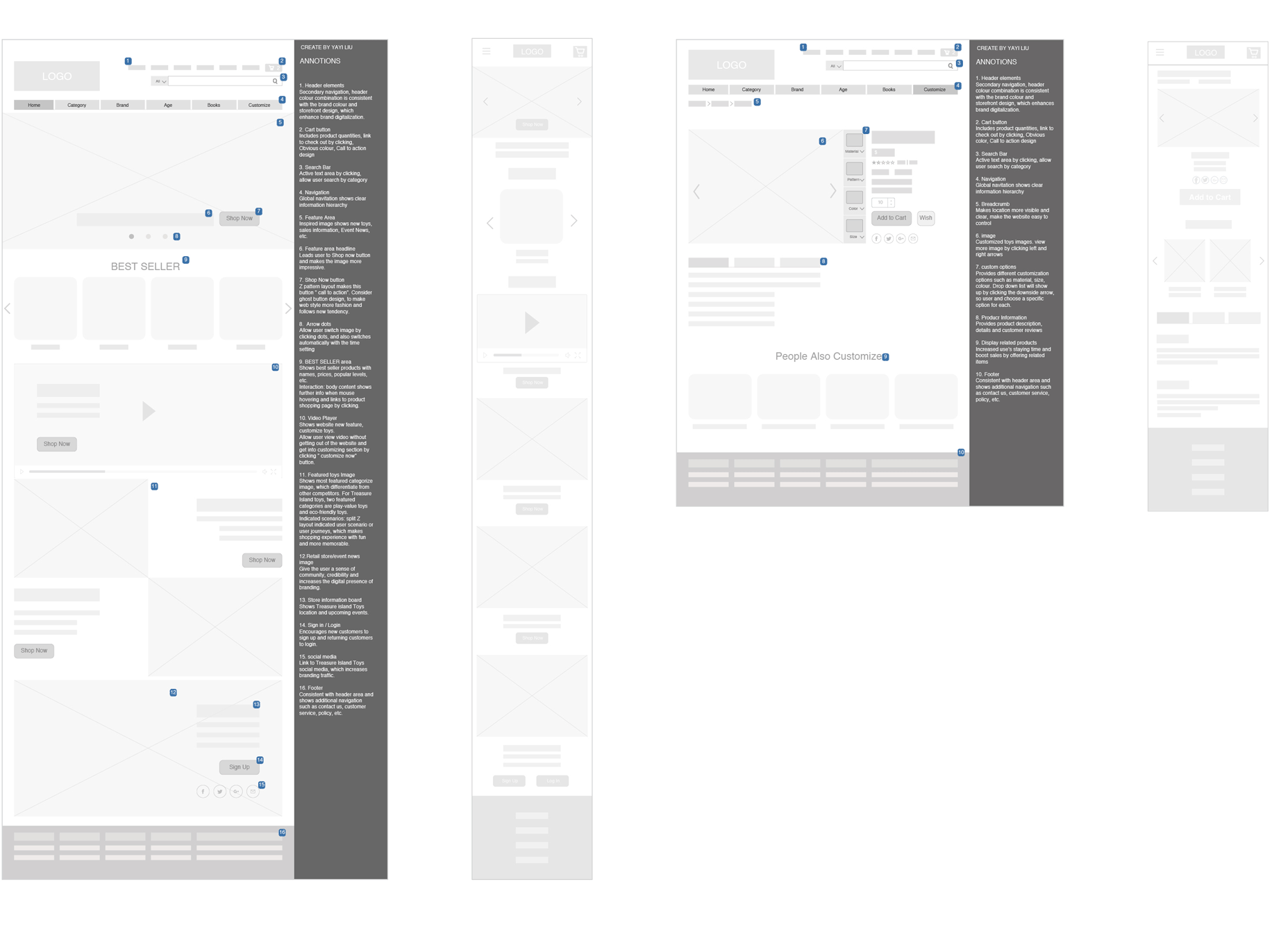
Split Z layout Pattern
Call-To-Action Design
Place the CTAs on the right side, at the end of the line as the user will slightly pause at the end before moving down. The split Z pattern develops a rhythm of CTA with a series of Z movements that keeps user’s interest.
Story Telling
The split Z layout is useful for storytelling, any storytelling aspect of the design would follow the path of Z. The mobile layout displays elements in vertical which are more simple than the desktop layout.
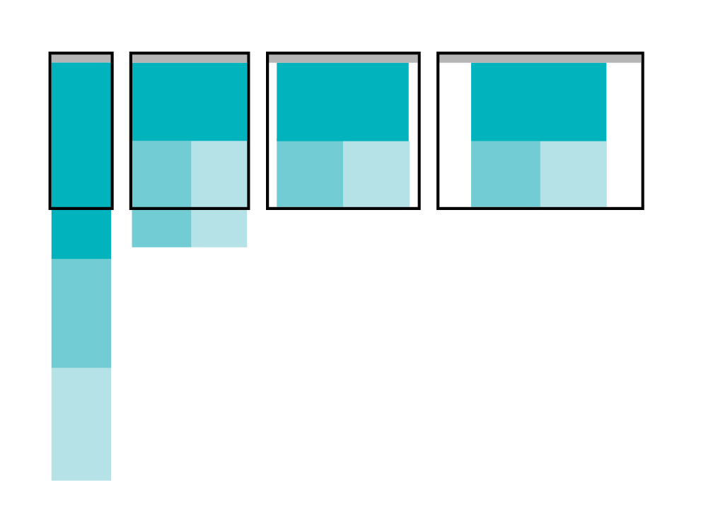
Responsive Design
Grid System - 12 columns
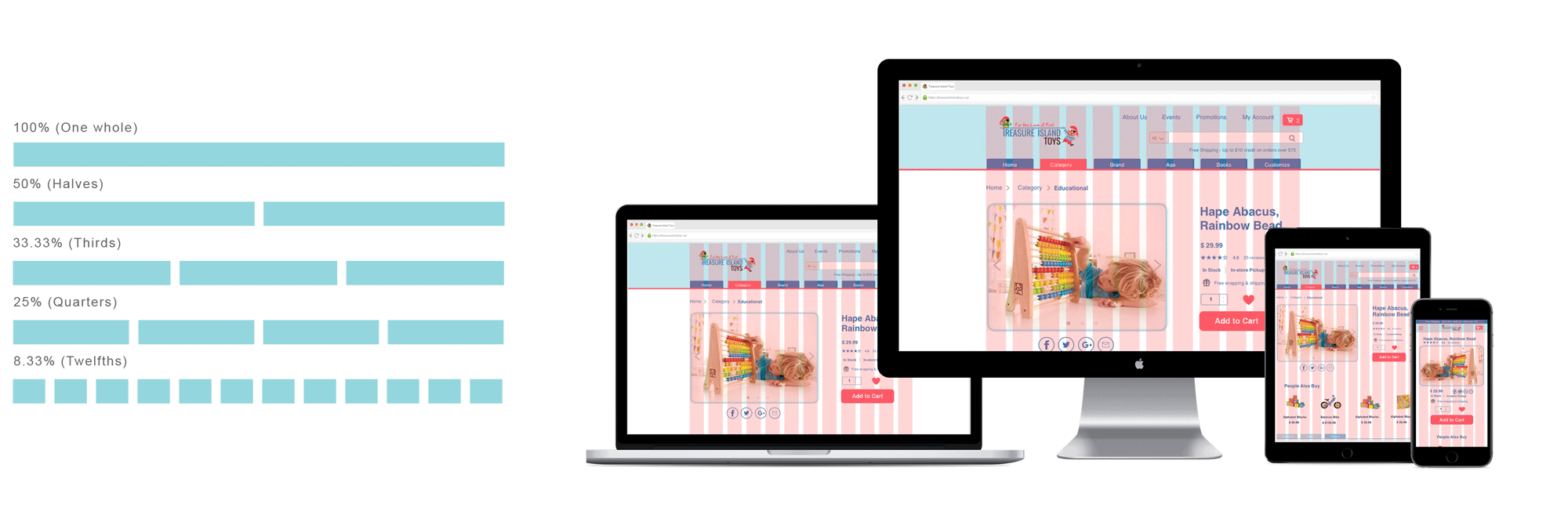
Mostly Fluid Responsive Layout
At narrowest viewport, each element simply stacks vertically.
Once layout hits its widest viewport, margins are added to the left and right, instead of expanding things out
Mobile First Design
The project considered the responsive design in different device and screens, and it used the mobile-first approach which was a tenet of progressive enhancement. Mobile first = content first.Think about what is really important and set content priorities. The mobile screen should have the most essential content.
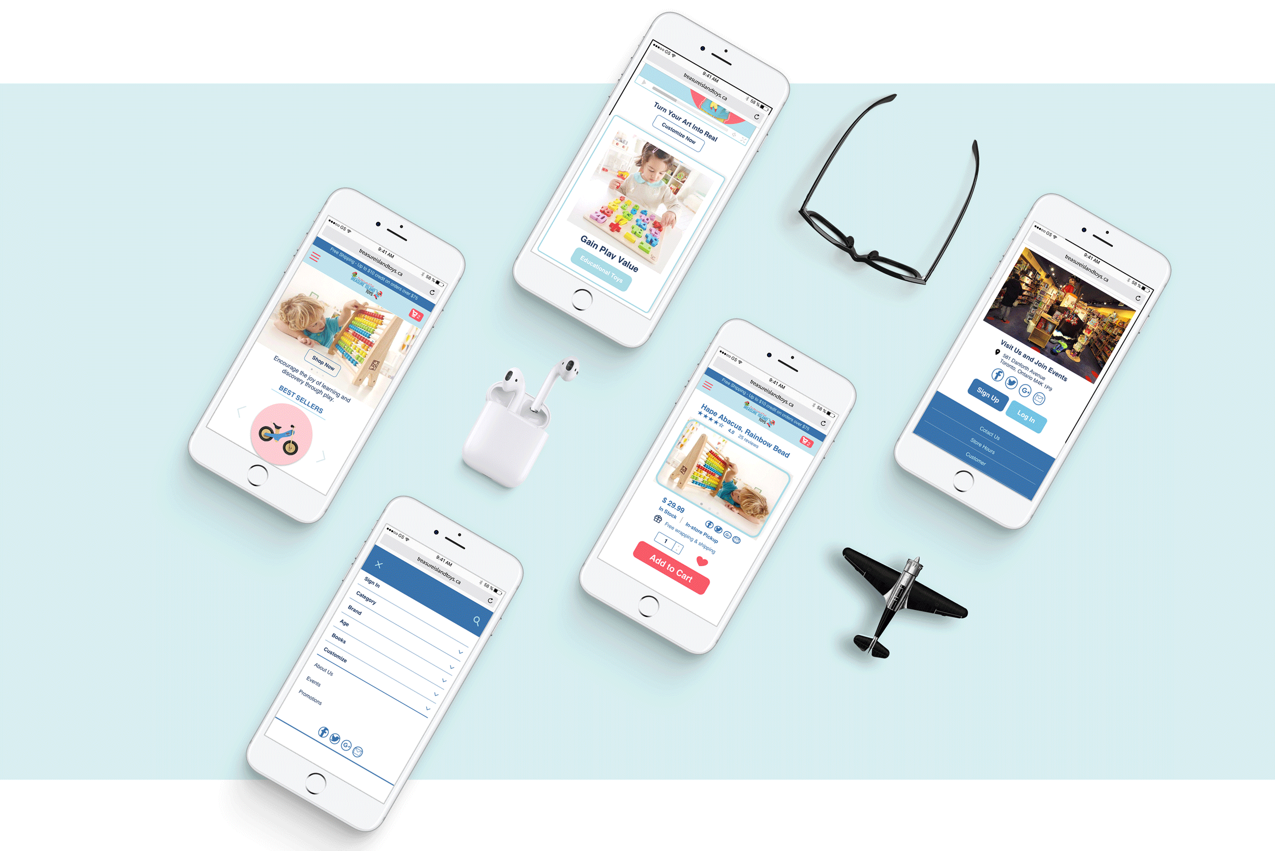
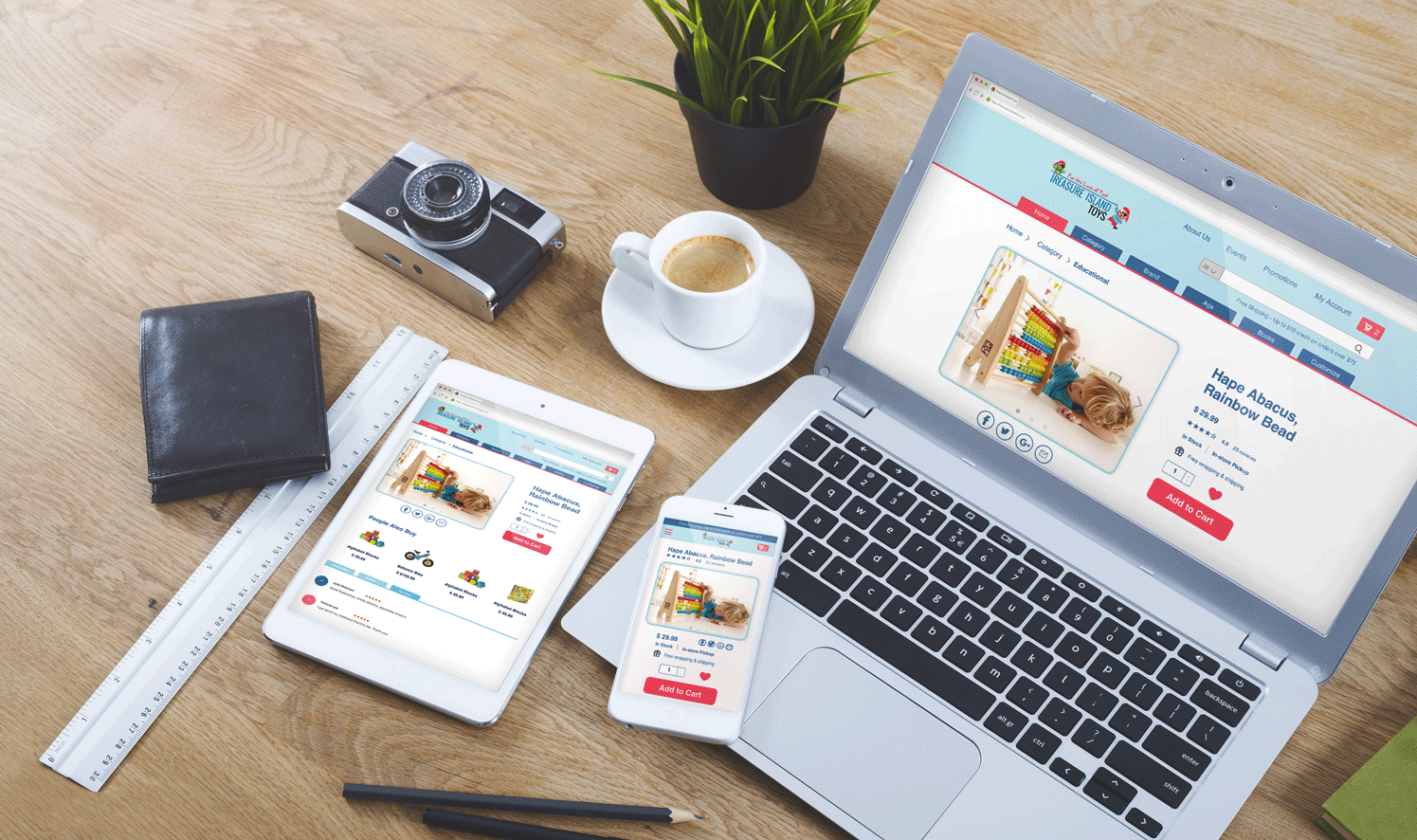
Visual Mockups

Based on the UX Research and strategy, I applied these strategies to User Interface Design. The visual style is modern and fresh, and the color theme is extracted from the logo and store, which is consistent with the brand and product. In addition, the call-to-action design and multimedia showcase would be helpful to increase the convention rate for online sale. The mobile Interface is more simple and maintains the most important feature and content, and it highlights the color theme which would increase the brand awareness.